West Seattle Trails update: Early designs for wayfinding kiosks

wayfinderkiosks.jpg

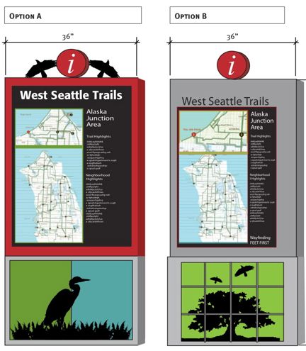
Those are two early design concepts presented to the city recently for the first 10 proposed wayfinding kiosks related to the trailblazing (in more ways than one) West Seattle Walking Trails project we first told you about 2 months ago when local activist Chas Redmond was looking for map feedback. Read on to see what kind of feedback he and the local pedestrian-advocacy group Feet First got, and to find out what happens next with this project:

The project’s already been working with the city Transportation Department and Department of Planning and Development. Then came the Design Commission taking its first look, and Redmond says, “All commissioners indicated their satisfaction with and appreciation of the serious amount of background work and community involvement this project has gone through (and continues to go through) and that they were especially appreciative of the fact that this project was a template for both other neighborhoods and for the Pedestrian Master Plan. They all said it was a great project with great community input – causing one commissioner to say ‘only in Seattle’.”

He says they did have several suggestions, including:

*make sure the map and wayfinding system address both visitors and locals

*keep the kiosks simple for maintenance and cost; Redmond says they agree in concept but there’s a potential complication with new standards set by DPD and SDOT that they have to work within

*make sure they are easy to update

*use existing street-sign poles instead of planting new ones; this too may conflict with some SDOT standards, so it’s a work in progress

*be mindful of sightline and sidewalk-right-of-way impacts; Redmond says city reps have been out to West Seattle already for an “on-location” session to work out those issues at the prototype kiosk donation at Delridge Library

WHAT’S NEXT: A variety of other steps including the $99,000 city grant application to fund some of the kiosks; map printing; city open houses for Neighborhood Matching Fund proposals such as this one; and once this proposal for 10 kiosks is successfully under way, a dozen more in other areas. Lots more information can be found on this website.

8 Replies to "West Seattle Trails update: Early designs for wayfinding kiosks"

  • E.M. Martin April 28, 2008 (3:34 pm)

    What a good idea! Both designs are great, the more colorful the better. Hope the designers are also considering some way to make the kiosks vandal-resistant. (Vandal proof is too much to hope for!) Perhaps residents and businesses near the kiosks could participate in cleaning off tags, in the same way people who “adopt” and maintain trash containers at Metro stops do now.

  • snowlion April 28, 2008 (6:09 pm)

    I concur, both designs are good, why not have a variety? :)

  • baba nulu April 28, 2008 (7:28 pm)

    Looks OK from here, but could I see the braille version?

  • miws April 28, 2008 (7:40 pm)

    The signs’ appearance is important, but I would also request function play as much, if not a little more, of a role.

    .

    I realize text size might be limited, but would also like contrast between the text and backgound be considered. One of my biggest frustrations in trying to read anything is if it has a red on black, or some other dark color combination, or vice versa. I don’t know how much of it has to do with my red/green colorblindness, or if normally color sighted people also have the problem of distinguishing contrast.

    .

    Mike

  • credmond April 28, 2008 (9:26 pm)

    Americans with Disabilities Act compliance is part of the requirement. We have been working on ways to make the trails accessible to blind and vision-impaired individuals and concepts along those lines will be brought up during the community outreach process, which will be extensive for each of the 10 kiosks.

    One idea worthy of discussion is using podcasts keyed into the different kiosks with directions of departure part of the podcast series – sort of like “Alki to Admiral via Ferry heading south.” The podcast would then describe the features timed to someone walking along that route. Hazards could even be included. These concepts require even more volunteer effort, so if anyone is already interested, email “seth@feetfirst.info” or “credmond@mac.com.”

  • Vlad April 28, 2008 (9:39 pm)

    Nice work! I agree that both options look great, in fact they look like they might be from the same series. I hope that there can be some variation in individual neighborhoods.

  • credmond April 29, 2008 (9:47 am)

    Vlad,

    Each of the 10 initial kiosks will be developed through a community outreach process which will include significant efforts to have each of the neighborhoods develop unique art for each kiosk. The bottom panels (in the draft designs) are where local art would be located and we expect all 10 initial kiosks to be unique from each other in this area as well as being specific to the area with respect to the history and description components. The basic colors and design have to be consistent with the Department of Planning and Development’s new “wayfinding” standards.

    The “on street” trail markers will be similarly standardized, but we did get a “win” from DPD with respect to the color of the on-street “blades” (as they’re called) – West Seattle’s on-street trail markers will be a Forest Green color and will be attached to existing street name poles. The location of these markers is also part of the process we’ll be engaging in later this year (assuming we’re successful with the grant!!)

  • jump April 29, 2008 (11:25 am)

    It sounds like Feet First has done a careful study to date. In the interest of constructive criticism and with the full knowledge that this is an early iteration, however, the graphic design is a little underwhelming. The typography could be more integrated and more expressive (while still readable), and the form of the sign more unique (the use of the bird silhouettes at the top is nice). And to respond to some other comments, good design is not only aesthetic but functional, sustainable and accessible.

Sorry, comment time is over.